Student conference and colaborative projects - 2nd semester
1) Speculative design workshop
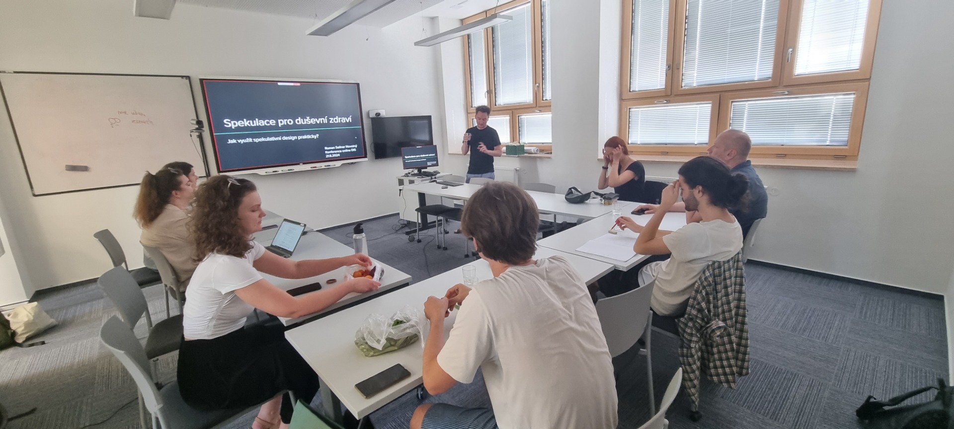
Mind blowing Speculative Design is an approach within design that focuses on creating provocative and imaginative scenarios to explore and critique potential futures. It involve for example Future Scenarios. We Crafted during a workshop leaded by Roman Sellner Novotný hypothetical and abstract situations that challenge the current status quo. Our working group topic was speculative design for mental health - what can can go wrong on a new calming capsule service for anxious people.

2) Zlin Design Week conference
I visited Zlín for five days in May 24 to get inspiration from Zlin Design Week for my study of information service design and came back full of positive impressions, impressions and information that gradually fit together like puzzle pieces and connect into new skills for the world of innovation. You will find all articles in section "conferences"


3) Inclusive design presentation
Dog Friendly Office presentation was my topic from my very own perspective. I provided my class with information of the overall statistic data and my photo documented experience with our boxer dog Garry who come with me to work daily and also coming with me for business trips. I also asked my colleagues who also bring their dogs to work how they benefit from dog friendly office and what they want to change. I finished by this semester work Inclusive design studies leaded by great lecturer Robert Osman who knows everything from inclusive design practically.
4) Data for Service Design - individual work
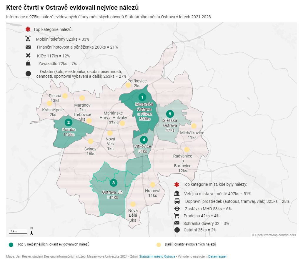
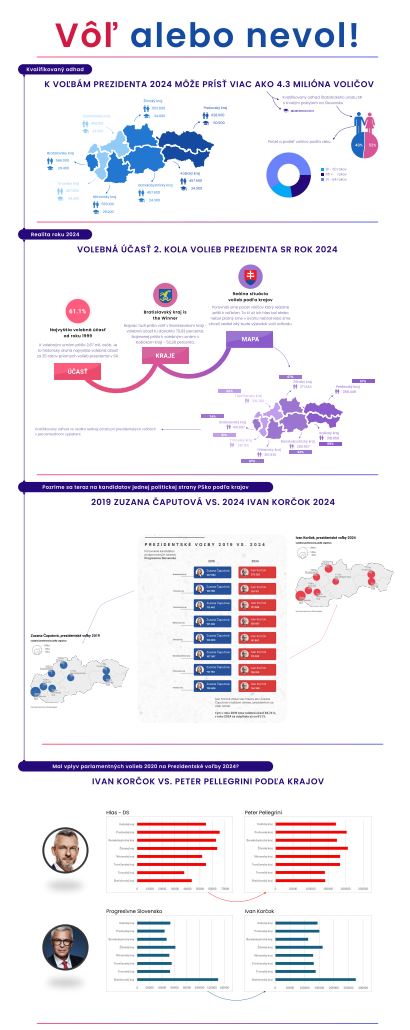
We went through this extraordinary course by lecturer Gabriela Godišková and learned a data magic. Big surprise for me as a corporate guy was use of open source data. As individual work I prepared this example in Datawrapper tool and I enjoyed that a lot, spending hours to learn perfectly new practices with data preparation and visualisation:
5) Interaction Design workshop
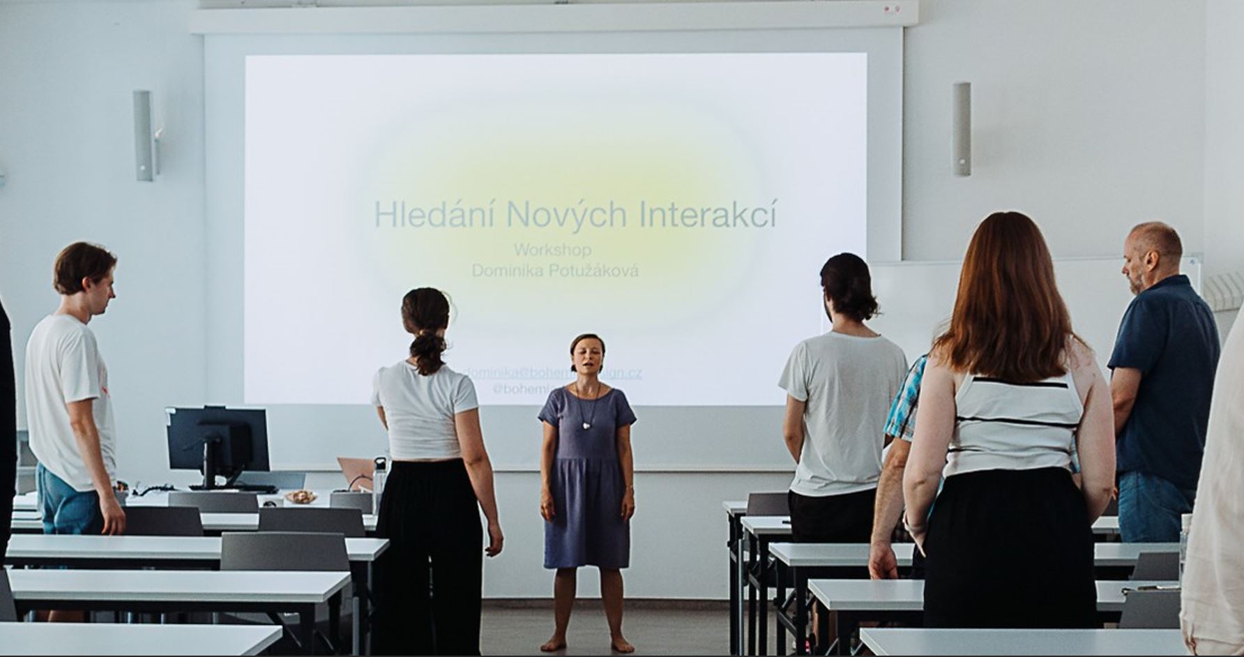
Dominika Potužáková, multidisciplinary designer, introduced us to interaction design during the on-site workshop.
6) Own project presentation
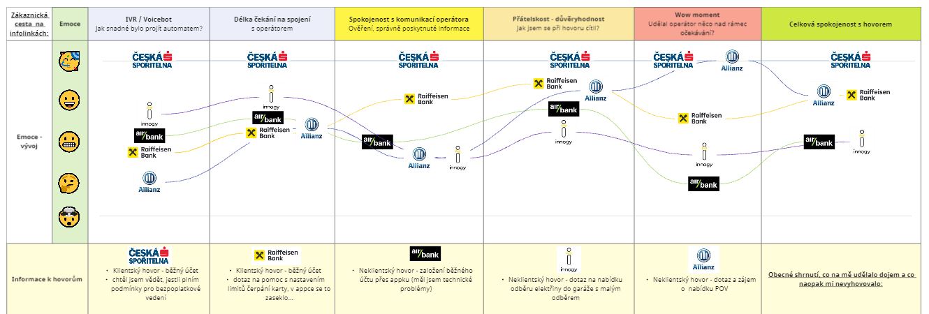
As a callcenter professional I prepared this semester different call centers benchmark to dig out best ideas how to run an excellent customer service and map out the process from customer end to end point of view. I explained during my 15 minutes presentation how I created my very own methodology for quantitative research and collect feedback from callcenter operators by crowd mystery shopping calling to different companies as a client or new potential client. We discovered couple of unique hints we can inspire by.
7) Data visualisation - team work
8) Academic English classes I
For the essay and presentation I prepared introduction to Customer Experience to getting know how this relatively new field of expertize can help to improve customer satisfaction with compainies and their services or products. I had final presentation in person in Masaryk University and I really enjoyed lively discussion with teacher and classmates.

My data diary project with data observation around me:
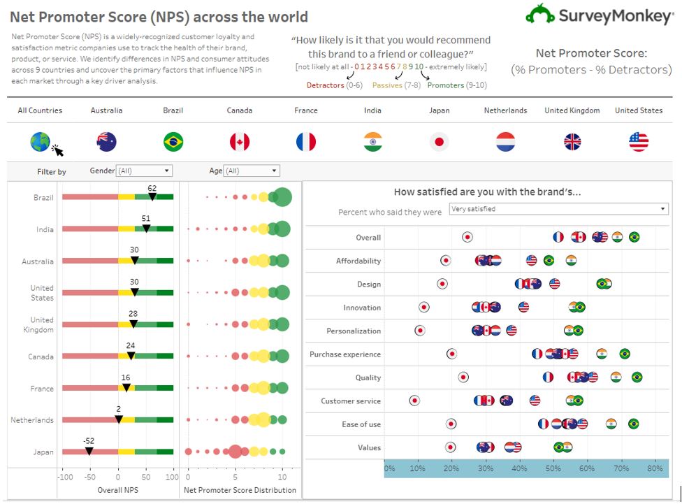
Net Promoter Score (NPS) measurements on the same scale from 0-10 points vary between nations. Why, when it's a uniform metric and how to deal with it on a business level?NPS is useful for measuring and comparing customer satisfaction and loyalty over time and between different products or markets. Net Promoter Score (NPS) measurements vary between nations due to cultural differences in customer experience ratings and customer service expectations. For example, in countries such as the Czech Republic, Slovakia, Japan, and South Korea, people tend to give more moderate ratings due to cultural practices, whereas in the U.S., ratings can be more pronounced and positive. When comparing NPS internationally, it is important to explicitly take these cultural factors into account and to adapt the interpretation of the data to avoid misleading conclusions.When reading and using these data for international comparisons, it is important to:1. Understand the cultural context: each country may have a different way people rate their experience, which affects the overall score.2. Normalize the data: for more accurate comparisons, it may be useful to normalize the data to eliminate biases caused by different cultural practices.3. Use relative comparisons: instead of absolute NPS values, it may be more useful to compare changes in NPS over time or the relative performance of competitors in the same market. This is also a way to set KPIs in the company to avoid unrealistic expectations and employee frustration at not being able to achieve goals.A sample of typical NPS values by nationality, which I can confirm from my own experience of processing customer satisfaction data at Avast, a global antivirus company: Net Promoter Score (NPS) across the world (surveymonkey.com)
2) NPS Theme II. - How to recognize fake NPS measurements and why it happens:
The misalignment of KPIs by companies towards employees feeds into various adjustments and measurement bending. Cheating in setting up NPS measurements or any other customer satisfaction metrics is neither ethically correct nor useful for business. True and transparent NPS measurement provides valuable information that can help improve products and services and strengthen customer relationships. Manipulation of data can lead to poor business decisions and damage to a company's reputation, but it happens quite often because of pressure from company executives toward managers and rank-and-file employees who have set financial bonuses to pay based on NPS measurements.
Net Promoter Score (NPS) is a metric that measures the likelihood that customers would recommend your company, product or service to others. The formula for calculating NPS is fairly simple:
1. Know the responses: First, ask customers how likely, on a scale of 0 to 10, they would be to recommend your company (product, service) to friends or colleagues.
2. Classify the answers: divide customers into three categories based on their answers:
o Promoters (9-10): Extremely likely to recommend.
o Passive (7-8): They are satisfied but not so enthusiastic that they actively recommend.
o Critics (0-6): Unlikely to recommend, may have a negative opinion.
3. Calculate percentages: calculate the percentage of promoters and the percentage of critics out of the total number of responses.
4. Calculate NPS: Subtract the percentage of critics from the percentage of promoters. The result is your NPS, which can range from -100 (if all customers are critics) to +100 (if all customers are promoters).
So the formula looks like this: {NPS} = {% Promoters} - {% Critics})
The most common types of erroneous or fraudulent NPS measurements I have encountered:
1) Rating on a scale of 1-10 rather than 0-10, this increases the resulting average NPS value
2) Emphasizing the graphic (UX) or verbal (when evaluating a call from a call center) when promoting and pointing out that it is good to rate on a 9 or 10 scale
3) Redesigning the 0-10 scale into stars (typically 5 stars) or emoticons and then non-transparently recalculating the value into NPS according to an internal key.
4) Modify the question, this degrades the entire NPS measurement
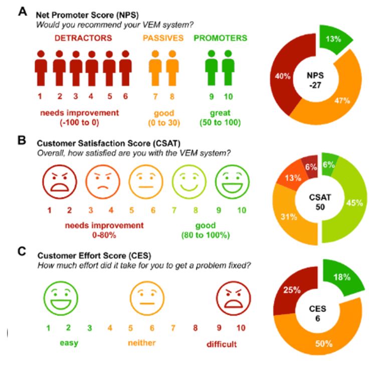
5) Intentionally confusing NPS measurement with CSAT (customer satisfaction) or CES (Customer Effort Score) measurement, which are measured on different scales and with different questions, but to the layperson these metrics are simply interchangeable:
3) Practical use of the Prague Integrated Transport (PID) Open Data in a pub near Masaryk Station
At the Minirest restaurant near Masaryk Station in Prague, passengers don't have to worry about missing trains or public transport connections thanks to an online information board with apt announcements about departure times for guests of the "station" open until the morning, e.g.: "Time to pay and go", "You're late", "Bad luck, have another one".
The information screen warns of the time remaining until departure. The board was designed by one of the regulars, implemented by the restaurant and is very popular with local and foreign visitors who often take photos of it.
At first glance, I was impressed by the accuracy and calculation of the stop's walkability at the proposed time, and also that the information on the board is complete and includes platform and train signage. On second glance, I found that the open data from the PID is used as the data source and is accurate, including the indication of the current delay.
A great idea and a clear implementation attacking the genius of GPT chat, because when you go home from Prague in the evening for one or two last beers before parting, you don't have to worry about anything else or anything else, because you know when you'll get home.
Photos from the infotable here:

4) Don't get lost in the data - comparing data in navigation software with maps and reality on the road
When comparing maps, Waze and real traffic signs, we can encounter a number of flaws and errors that can lead to inaccuracies and sometimes comical or frustrating situations. Here more
1. Faulty navigation instructions and outdated maps: Waze and other navigation systems can sometimes rely on outdated or incorrect information. They may direct drivers to one-way streets in the opposite direction or suggest routes that take them through closed or impassable roads, even though the apps are connected online. Some map applications may not be updated regularly, leading to situations where newly built roads are not shown on the map, or conversely, maps show roads that no longer exist.
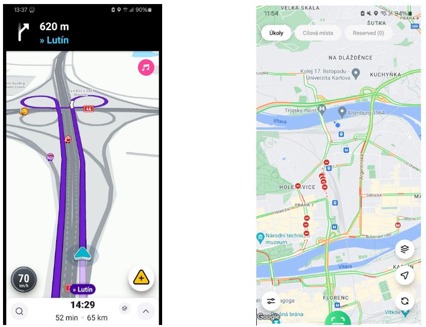
2. Differences in road markings: the actual road markings may be inconsistent with what the map applications show. This can cause confusion when drivers are following navigation but come across new or temporarily changed signage. Last time I wanted to enjoy driving at Zlín Design Week and not turning on my navigation on my phone. I knew the route through Olomouc from the past, but due to the current detours, the road signs were inconsistent and not only did I get lost, I ended up going the wrong way on the motorway and had to turn around and come back after many kilometres. So relying on a single source of information in navigation doesn't pay off in my opinion, with the right combination of navigation, local knowledge of the area and road signs you can travel without too much complication. Unfortunately, the world is becoming more complex.
3. Errors or "secret" adjustments in algorithms: Navigation algorithms can fail, for example by sending you on a longer route for no apparent reason, or failing to respond effectively to the current traffic situation. At the same time, cities can request preferred route planning from navigation companies so that car traffic across the city does not move to side streets or detour routes and degrade air quality or traffic flow for local residents at the expense of passing drivers, who then typically wait in large traffic jams. People regularly passing through the city, such as couriers or taxi drivers, very often use only an indicative view of traffic restrictions and congestion on the overall map and avoid them due to local knowledge of detour routes and one-way streets, many applications tailored for these professions based on open data online and dynamically display map-based cues for these specific needs. The shades of red indicate the level of impassability / congestion and closures:
